Preprocessing example, using feature extraction and reduction
To illustrate the concept of feature extraction and reduction, a dataset from the Wisconsin Breast Cancer Dataset will be used. While it is composed of 30 features (columns), only 10 are shown.
from sklearn.datasets import load_breast_cancer
import pandas as pd
cancer = load_breast_cancer()
cancer_df=pd.DataFrame(cancer.data,columns=cancer.feature_names)
cancer_df.iloc[:, 2:].head(10)
| mean perimeter | mean area | mean smoothness | mean compactness | mean concavity | mean concave points | mean symmetry | mean fractal dimension | radius error | texture error |
|---|---|---|---|---|---|---|---|---|---|
| 122.8 | 1001.0 | 0.118 | 0.278 | 0.3 | 0.147 | 0.242 | 0.079 | 1.095 | 0.905 |
| 132.9 | 1326.0 | 0.085 | 0.079 | 0.087 | 0.07 | 0.181 | 0.057 | 0.544 | 0.734 |
| 130.0 | 1203.0 | 0.11 | 0.16 | 0.197 | 0.128 | 0.207 | 0.06 | 0.746 | 0.787 |
| 77.58 | 386.1 | 0.142 | 0.284 | 0.241 | 0.105 | 0.26 | 0.097 | 0.496 | 1.156 |
| 135.1 | 1297.0 | 0.1 | 0.133 | 0.198 | 0.104 | 0.181 | 0.059 | 0.757 | 0.781 |
| 82.57 | 477.1 | 0.128 | 0.17 | 0.158 | 0.081 | 0.209 | 0.076 | 0.334 | 0.89 |
| 119.6 | 1040.0 | 0.095 | 0.109 | 0.113 | 0.074 | 0.179 | 0.057 | 0.447 | 0.773 |
| 90.2 | 577.9 | 0.119 | 0.164 | 0.094 | 0.06 | 0.22 | 0.075 | 0.584 | 1.377 |
| 87.5 | 519.8 | 0.127 | 0.193 | 0.186 | 0.094 | 0.235 | 0.074 | 0.306 | 1.002 |
| 83.97 | 475.9 | 0.119 | 0.24 | 0.227 | 0.085 | 0.203 | 0.082 | 0.298 | 1.599 |
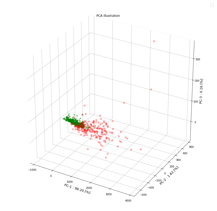
Using the head() method we can clearly see the 10 features corresponding to each column name of the data set (e.g. mean perimeter, mean area, etc) for first 10 biological samples. Because of limitations in hardware resources and the training efficiency of certain ML algorithms, high dimensionality may often pose difficulties due to sheer size of the dataset. For this reason we commonly have to employ feature extraction and reduction techniques. One such useful method is the principal component analysis (PCA). In the following steps the number of features is been reduced to 3 principal components that can be easily visualized using a 2D/3D scatter plot. The cancer is either malignant (shown as red dot) or benign (shown as green star)
from sklearn.decomposition import PCA
from sklearn.preprocessing import scale
from matplotlib.patches import FancyArrowPatch
from mpl_toolkits.mplot3d import proj3d
import numpy as np
import matplotlib.pyplot as plt
class Arrow3D(FancyArrowPatch):
    def __init__(self, xs, ys, zs, *args, **kwargs):
        FancyArrowPatch.__init__(self, (0,0), (0,0), *args, **kwargs)
        self._verts3d = xs, ys, zs

    def draw(self, renderer):
        xs3d, ys3d, zs3d = self._verts3d
        xs, ys, zs = proj3d.proj_transform(xs3d, ys3d, zs3d, renderer.M)
        self.set_positions((xs[0],ys[0]),(xs[1],ys[1]))
        FancyArrowPatch.draw(self, renderer)

labels=cancer.target
cdict={0:'red',1:'green'}
labl={0:'Malignant',1:'Benign'}
marker={0:'o',1:'*'}
alpha={0:.3, 1:.5}
scaled = scale(cancer_df, with_mean=True, with_std=False)
pca_model = PCA(n_components=3)
pca= pca_model.fit_transform(scaled)
pca_exp_mn = pca_model.explained_variance_ratio_
max_Var=np.transpose(pca_model.components_[0:3, :])
pca_1, pca_2, pca_3 = pca_exp_mn[0]*100, pca_exp_mn[1]*100, pca_exp_mn[2]*100
fig = plt.figure(figsize=(15, 15))
ax = fig.add_subplot(111, projection='3d')
#ax = Axes3D(fig)
ax.xaxis.pane.fill, ax.yaxis.pane.fill, ax.zaxis.pane.fill = False, False, False
ax.set_title("PCA illustration ")
ax.legend(['Malignant', 'Benign'], fontsize=15, loc='best')
ax.set_xlabel('PC-1 : %.2f [%%]'%pca_1, fontsize=13)
ax.set_ylabel('PC-2 : %.2f [%%]'%pca_2, fontsize=13)
ax.set_zlabel('PC-3 : %.2f [%%]'%pca_3, fontsize=13)
y_M, y_B =1, 0           # Logical statement for Benign indication
xs, ys, zs = pca[:,0], pca[:,1], pca[:,2]

s_x, s_y, s_z = 1.0/(xs.max() - xs.min()), 1.0/(ys.max() - ys.min()), 1.0/(zs.max() - zs.min())
for l in np.unique(labels):
    ix=np.where(labels==l)
    ax.scatter(xs[ix],ys[ix],zs[ix],c=cdict[l],s=40,label=labl[l],marker=marker[l],alpha=alpha[l])
    n = max_Var.shape[0]
    for i in range(n):
        mean_x, mean_y, mean_z = max_Var[i,0], max_Var[i,1], max_Var[i,2]
        a = Arrow3D([mean_x,0.0], [mean_y,0.0], [mean_z,0.0], mutation_scale=15, lw=3, arrowstyle="<|-", color="r")
        ax.add_artist(a)

        if labels is None:
            ax.text(max_Var[i,0]* 1.15, max_Var[i,1] * 1.15, max_Var[i,2] * 1.15, "Var"+str(i+1),
                    color = 'g', fontsize=14, ha = 'center', va = 'center')
        else:
            ax.text(max_Var[i,0]* 1.15, max_Var[i,1] * 1.15, max_Var[i,2] * 1.15, labels[i],
                    color = 'g', fontsize=14, ha = 'center', va = 'center')
Interactivity console
Here is an interactive console with the loaded cancer dataset to try out:

This work is licensed under a Creative Commons Attribution-NonCommercial-ShareAlike 4.0 International License.